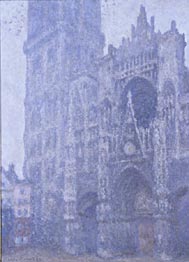
Claude Monet, La Cathédrale de Rouen
© Musées de la ville de Rouen
The monochromatic color scheme uses variations in lightness and saturation of a single color within the Color Wheel. This color scheme gives the feeling of simplicity, elegance, and cleanliness. All Monochromatic colors go well together, making this scheme easy to manage, and producing a soothing and calming effect. The monochromatic scheme is very easy on the eyes, especially with blue or green hues. The selected color can be integrated with neutral colors such as black, white, or an in-between gray. When using Monochromatic colors, keep in mind that it does not work to depict or emphasize a particular element within the composition. The reason for that is the lack of color contrast. (not to be confused with value contrast: how light or dark a color or neutral gray can be represented.)
In the examples presented, we see two of Monet masterpieces painted using this particular color scheme where the color of choice is blue and all its variations. Of course, there are small elements of its split complementary: yellow orange (right,) but the overall color structure corresponds to the Monochromatic type. These are two of a series of twenty-eight views of the façade of Rouen Cathedral that Monet painted between 1892 and 1894 using different color schemes.
The number one advantage of using monochromatic colors is that it always looks visually appealing and balanced. On the other hand, its chief disadvantage is that it lacks vibrancy and energy. Analogous colors provide all the advantages of monochromatic ones, retaining the simplicity and elegance of the monochromatic scheme, while adding more life and energy.
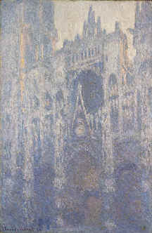
Claude Monet, Rouen and Paris, 1894
Oil on canvas 39 3/8
x 25 9/16
in.
The J. Paul Getty Museum © 2001