| HOME |
Color Schemes |
There are several Color Schemes that artists, decorators, designers, and Web developers can use for their creations. Color Schemes are combinations of colors that create a pleasant and harmonious balance. Colors schemes provide the artist with a set of colors that work well with each other. These schemes are: Monochromatic, Analogous, Triadic, Complementary, Split Complementary, and Tetradic. There are three others that are used more frequently in design, and they are: Achromatic, Clash, and Neutral.
It is important to note that when a scheme is selected for a project, particularly painting, the artist can also use other colors to supplement the chosen combination. When you study the Impressionists, focus on the small details, and you will see a wide array of colors in a very small area. The idea with color schemes is simply to give you the predominant colors with which you are building everything else.
Before we go any further it is important to define a few terms:
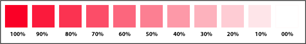
Color Saturation: Chromatic purity. In simple words it means how much of a color is present in a mixture. In the following example, there are varying degrees of saturation for that particular red color:
Hue: Webster's defines it as: a : COLOR b : gradation of color c : the attribute of colors that permits them to be classed as red, yellow, green, blue, or an intermediate between any contiguous pair of these colors. In other words, any color except black or white.
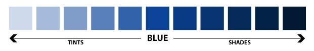
Tint: A color mixed with white. Example: Blue is a hue, baby blue is a tint.
Shade: A color mixed with black. Example: Red is a color, brown is a shade. Because in painting with oils we don't use black in our palette, it is important to know that our substitute for black is a mixture of Burnt Umber and French Ultramarine Blue.
Value: Webster's defines it like: a : relative lightness or darkness of a color : LUMINOSITY b : the relation of one part in a picture to another with respect to lightness and darkness. We are going a step further to explain this one because in order to understand volumes, you have to understand values. Let us look at these squares. They have different colors and different degrees of "lightness" or "darkness."

Now, say we take a black and white photograph of these colors. The resulting picture would look like this:

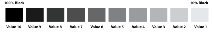
From this picture we can then conclude that two or more different colors can have the same or similar value. Keep that in mind when you paint objects that require volume. The more the contrast in value, the more dramatic the volume it creates. If we arrange the values of grays from 100% Black to 10% Black, we can build what is known as the Gray Scale, which consists of 10 values as shown in the diagram:
Tone: The combination of a color and a gray.
Neutral Gray: Combination of black and white.
Key Color: Dominant color in a color scheme or composition.
Chroma: The brightness or dullness of a color. Example: Yellow has a higher value that blue.
Graphics by Santa Maria Studio. All Rights Reserved. © 2003