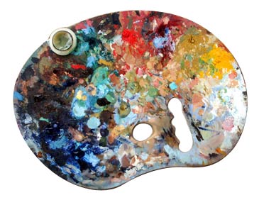
 When it comes to
color mixing there is a little theory involved in the beginning, and the rest is
practice, practice, and then some more practice. Also, don't be afraid of
experimenting. Remember that even the great masters became frustrated.
Let's dig into the theory so we can practice ASAP. The ultimate goal of
the practice of color mixing should be that it
becomes an instinctive reflex, and not something we have to think about.
Just like driving a car. In the beginning you have to think about turning
right or left, accelerating or slowing down, watching for other drivers, using
your turn signals, etc, etc, etc. After driving for some time, we begin to gain
confidence and feel comfortable with it, until eventually we don't even think about it. If you were to
ask us: "How did you get that color you just applied?" We would have to
stop, and actually think and retrace our steps to understand how we just did
something while we were not even thinking about it. That is what we are
after with every student.
The palette is the "color factory" from which all
colors come from. Just a few rules before we go to
specifics:
- Try not to mix more that three colors at one time. When you have too
many in a mix, you actually produce what artists call "dirty
colors" or "muddy colors" These resulting colors are unpleasant
to look at, and they distract from the total color harmony.
- It is a good idea to work with as many brushes as necessary to keep each
color clean and pure.
- You can mix colors on the palette or on the canvas. As you add
colors to your mix, it is the canvas where the final color interaction will
occur. Thus, a color may look perfect on the palette, but totally out
of gamma or value when placed on the painting surface.
- To lighten a color, you must add a lighter color (generally white,) and
conversely add more dark color to darken the mix.
- Colors are considered cool or warm, depending on the color
temperature. Warm colors are in the hues of red, yellow, orange, etc.
and these colors bring the objects painted closer to the eye of the
viewer. Examples of cool colors are blue, blue-green, purple-blue,
etc. and these colors make the objects appear as though they are far from
the viewer. So, in addition to linear perspective, we use color
temperature to place elements within a certain depth.
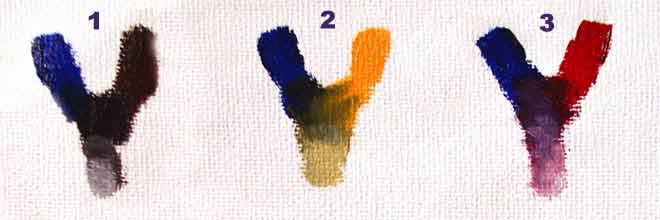
Here are the four basic color group mixes based on the Santa
Maria Palette. The top colors are the pure pigments. They
form a different color as they mix, and Titanium White has been added to the
resulting color to see the change in value.

In this trio, the color on the left is French
Ultramarine, followed by Burnt Sienna (1,) Cadmium Yellow
Medium(2,)
and Alizarin Crimson(3.)
| 1: This is why we don't use Black: French Ultramarine and Burnt Umber create a color that
"looks" exactly like black, but it has the advantage of
providing you with a cold, or warm black, depending on the amount of each
initial color. In addition, when combined with white, it yields a
pleasant gray. |
2: This mixture is with Cadmium Yellow Medium and
provides with a warm green that is very useful, more so, since in our
palette we don't use but one green (Viridian) which happens to be in the
cool side. |
3: Again, since we don't have any purples in our
palette, this combination with Alizarin Crimson provides one of the most
beautiful and vibrant purples available. The same cannot be said if
we use Phthalo instead of French Ultramarine. Keep that in mind as
you mix your colors. |

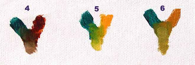
In this trio, the color on the left is Viridian Green,
followed by Burnt Amber (4,) Cadmium Yellow Medium (5,)
and Yellow Ochre (3.)
| 4: This is a wonderful combination that works
great on cool flesh tone on portraits and equally good on landscapes and
still lives. When white is added, it provides a very good gray for
neutral areas. Practice will help you find the perfect balance for
warm or cool colors that come from this family of hues. |
5: This mixture with Cadmium Yellow Medium provides
the warmest and brightest green. It can be toned down with Yellow
Ochre or cool down even more with a touch of Phthalo Blue. |
6: Yet another green to add to our repertoire of
greens. This one is also warm, but not as bright as the previous
color. Mixed with white, provides a cooler green that is great for
sending objects farther into the painting. |

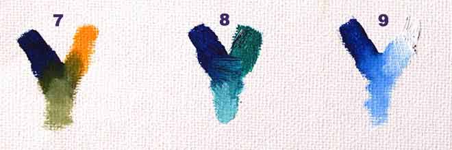
In this trio, the color on the left is Phthalo Blue,
followed by Cadmium Yellow Medium (7,) Viridian Green (8,)
and Titanium White (3.)
| 7: Now you are starting to understand why we
don't need greens in our original palette. This is a subtle, unassuming
green that is cool yet bright. Be very careful when you use Phthalo
Blue because this color is very strong and has the tendency to overpower
others. |
8: This mixture with Viridian Green gives us
one of the best colors for crystal clear water. Monet used it a lot in his
seascapes. Mediterranean paintings are loaded with this color.
For variety, add a touch of any of the yellow colors. |
9: We have not found a more fun color to apply to
clean, bright skies than this color. As you paint skies, remember to
add a little Yellow Ochre at the top of the painting, and more as you get
closer to the horizon. |

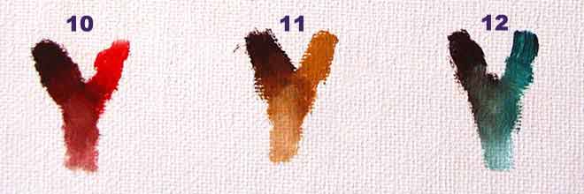
In this trio, the color on the left is Alizarin Crimson,
followed by Cadmium Red Medium (10,) Yellow Ochre (11,)
and Viridian Green (12.)
| 10: Very rich color that can be used in shadow
areas of red tones, especially when color brightness is a must. A
warm color by nature, can be mixed with French Ultramarine to obtain
purple tones that are nor as bright as mixture # 3 |
11: Wonderful earth tone that is full of life and is
great for portraits and all other applications. The sky is the limit
when it comes to uses for this color. |
12: A modest green that can easily pass for a gray
when used in the proper proportion. This color saves a lot of
artists from using "dirty" colors in cool areas of paintings. |
BACK TO TOP OF PAGE
Graphics by Santa Maria Studio. All Rights Reserved. © 2003
 When it comes to
color mixing there is a little theory involved in the beginning, and the rest is
practice, practice, and then some more practice. Also, don't be afraid of
experimenting. Remember that even the great masters became frustrated.
Let's dig into the theory so we can practice ASAP. The ultimate goal of
the practice of color mixing should be that it
becomes an instinctive reflex, and not something we have to think about.
Just like driving a car. In the beginning you have to think about turning
right or left, accelerating or slowing down, watching for other drivers, using
your turn signals, etc, etc, etc. After driving for some time, we begin to gain
confidence and feel comfortable with it, until eventually we don't even think about it. If you were to
ask us: "How did you get that color you just applied?" We would have to
stop, and actually think and retrace our steps to understand how we just did
something while we were not even thinking about it. That is what we are
after with every student.